Here’s a graph that goes up a lot:-
Now we’ve established which direction it’s travelling in, it’s probably about time to shed some light on what it actually represents.
It’s a graph showing the amount of organic traffic that one of our clients receives on Google.
In other words it’s how many people go to the world’s favourite search engine, tap in whatever they fancy and visit her site as a result.
She works in a niche industry and her customers tend to spend a lot of money so she doesn’t need to attract huge numbers of them to be making a profit.
But, like pretty much all of us, she does need a few. And, without wanting to sound greedy, a bit more than a few would be even better.
We’ve looked after her SEO for the last couple of years. Back when we started she had about 10 or 15 visitors to her site every month.
That wasn’t enough, even when she didn’t need huge numbers to make ends meet.
Then we started optimising her site.
Now she’s getting about 500 visitors a month.
That is translating into more customers than she can handle – and now she’s hit that landmark figure we thought it gave us an excuse to blog about it.
The whole process costs her a few hundred pounds a month. It already makes her between five and six times that in terms of money coming in. Touch wood but, like the graph, that number is only going in one direction.
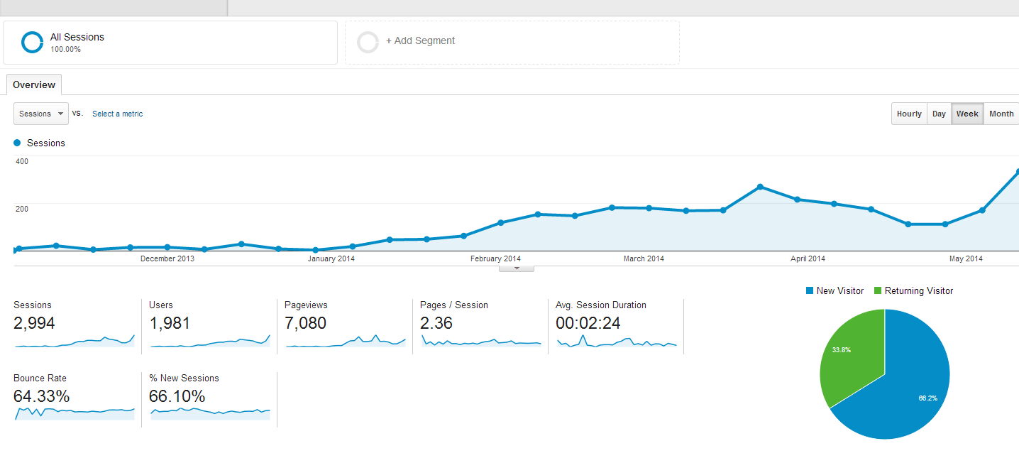
While we’re on the subject, here’s another graph that we are going to chuck in for good measure:-
It’s from a more recent client of ours – a client who regularly gets about 200 sessions a week on his site. As you can see, that figure was next to nothing a few months ago.
It won’t surprise you to learn that optimising his site has had a very similar effect on his business – he’s now moving premises and has advertised for two new members of staff to cope with increased demand.
But if you dig a little deeper there’s still room for improvement.
This second client is attracting a nice healthy amount of repeat customers to his site – better than the industry average. This suggests they must like and trust his content enough to return. It’s a good sign.
The average session duration is also nearly two and a half minutes – again that’s not to be sniffed at in his industry.
However, his bounce rate – the proportion of visitors who leave after only looking at one page – is 64%.
We are gradually bringing it down by improving the content and the user experience but it’s still higher than we’d like.
What do we make of this data?
It would appear that the people that like his site tend to really like it. They hang around for quite some time, move from page to page and a fair few return.
However, there are still too many at the other end of the spectrum that turn off too soon.
We are investigating why – it’s a slow process and involves a lot of trial and error. We are currently doing some in-depth A/B testing and things are gradually improving so we’ll see where that leads us.
The moral of the story? Driving people to your site is a vital piece of the jigsaw but it’s not the whole picture and there are always things you can do to improve conversions.
Even something as simple as changing a button can make the world of difference in the right circumstances – here’s proof.
Any digital marketing agency who focus solely on driving traffic to your site aren’t doing their job properly. The ultimate goal is paying customers.
Graphs like the two above are a pretty good start though – get in touch if you want to follow suit.


